Creating an ideal landing page for a software house requires careful consideration of design, content, and user experience.
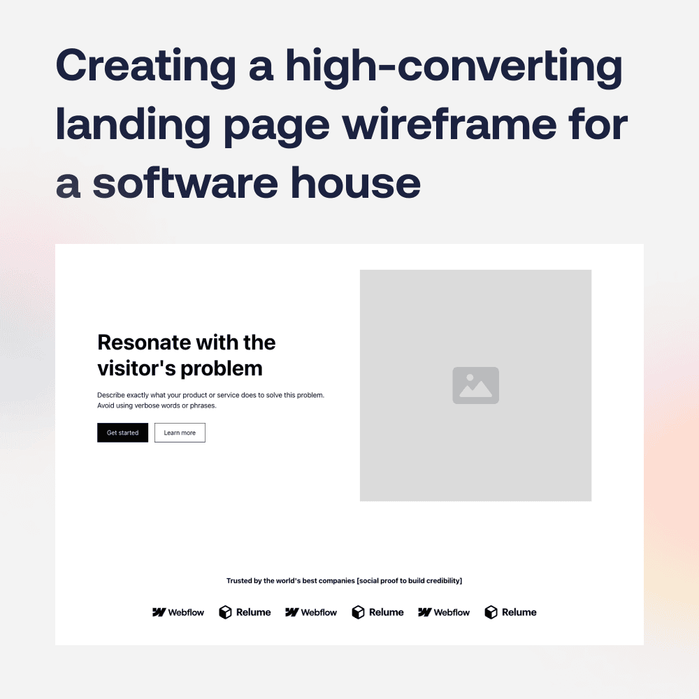
Here is an example of the structure we use most often, which works best when creating a high-converting landing page for a software house.

1. Clear and Compelling Headline
- Example: “We put tech in fintech”
- Tip: Make it clear what your software house offers and how it benefits the visitor.
2. Subheadline with Value Proposition
- Example: “We specialize in custom software development, web and mobile app solutions to elevate your business.”
- Tip: Address the specific needs of your target audience.
3. High-Quality Hero Image or Video
- Use visuals that reflect your services and the quality of your work.
- A video can introduce your company and showcase successful projects.
4. Call-to-Action (CTA) Buttons
- Example: “Get a Free Quote”, “Schedule a Consultation”, “Start Your Project”
- Tip: Use contrasting colors and make them stand out. Place CTAs above the fold and throughout the page.
5. Brief Introduction/Overview
- Describe who you are, what you do, and why you’re different.
- Example: “We are a team of expert developers dedicated to delivering top-notch software solutions. Our agile approach ensures your project is delivered on time and within budget.”
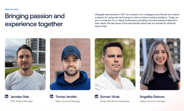
6. Services Section
- List your main services with brief descriptions.
- Example:
- Custom Software Development
- Web Development
- Mobile App Development
- UI/UX Design
- E-commerce Solutions
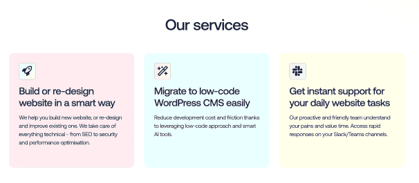
7. Portfolio/Case Studies
- Showcase your best work with images, descriptions, and results.
- Include client testimonials or video testimonials if possible.
- Tip: Highlight a diverse range of projects to show versatility.
8. Client Testimonials
- Real quotes from satisfied clients.
- Include names, photos, and company names for authenticity.
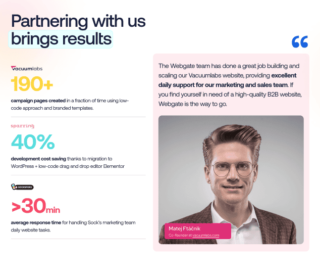
9. Trust Badges and Awards
- Display logos of certifications, awards, or partnerships.
- Tip: These elements build credibility and trust.

10. Detailed Contact Form
- Fields should include name, email, phone, company, and project details.
- Keep it as short as possible while gathering necessary information.
- Tip: Offer a secondary contact method like a phone number or email address.
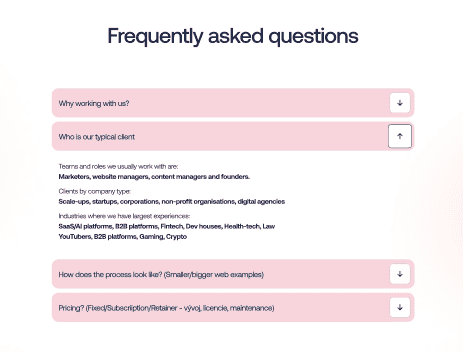
11. FAQs Section
- Address common concerns and questions.
- Tip: This can help overcome objections and reduce friction.
12. Blog or Resource Links
- Link to relevant blog posts, whitepapers, or case studies.
- Tip: This establishes thought leadership and keeps visitors engaged.
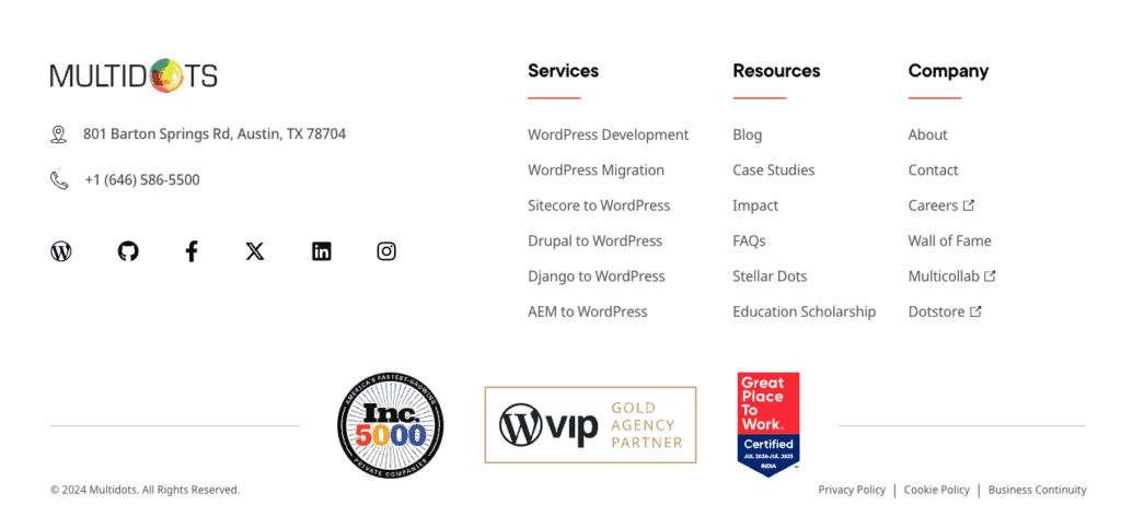
13. Footer with Additional Information
- Include links to privacy policy, terms of service, and contact information.
- Add social media links to encourage further engagement.
Design and Usability Tips:
- Responsive Design: Ensure the landing page looks good on all devices.
- Fast Load Times: Optimize images and code to reduce load times.
- Simple Navigation: Avoid clutter and keep navigation straightforward.
- A/B Testing: Test different headlines, CTAs, and images to see what converts best.
- Analytics: Use tools like Google Analytics to track performance and user behavior.


